InkWell class
A rectangular area of a Material that responds to touch.
For a variant of this widget that does not clip splashes, see InkResponse.
The following diagram shows how an InkWell looks when tapped, when using default values.
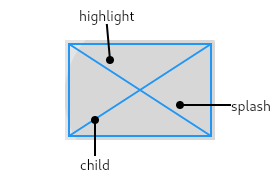
The InkWell widget must have a Material widget as an ancestor. The Material widget is where the ink reactions are actually painted. This matches the Material Design premise wherein the Material is what is actually reacting to touches by spreading ink.
If a Widget uses this class directly, it should include the following line at the top of its build function to call debugCheckHasMaterial:
assert(debugCheckHasMaterial(context));
Troubleshooting
The ink splashes aren't visible!
If there is an opaque graphic, e.g. painted using a Container, Image, or DecoratedBox, between the Material widget and the InkWell widget, then the splash won't be visible because it will be under the opaque graphic. This is because ink splashes draw on the underlying Material itself, as if the ink was spreading inside the material.
The Ink widget can be used as a replacement for Image, Container, or DecoratedBox to ensure that the image or decoration also paints in the Material itself, below the ink.
If this is not possible for some reason, e.g. because you are using an opaque CustomPaint widget, alternatively consider using a second Material above the opaque widget but below the InkWell (as an ancestor to the ink well). The MaterialType.transparency material kind can be used for this purpose.
InkWell isn't clipping properly
If you want to clip an InkWell or any Ink widgets you need to keep in mind that the Material that the Ink will be printed on is responsible for clipping. This means you can't wrap the Ink widget in a clipping widget directly, since this will leave the Material not clipped (and by extension the printed Ink widgets as well).
An easy solution is to deliberately wrap the Ink widgets you want to clip in a Material, and wrap that in a clipping widget instead. See Ink for an example.
The ink splashes don't track the size of an animated container
If the size of an InkWell's Material ancestor changes while the InkWell's splashes are expanding, you may notice that the splashes aren't clipped correctly. This can't be avoided.
An example of this situation is as follows:
To create a local project with this code sample, run:
flutter create --sample=material.InkWell.1 mysample
An InkWell's splashes will not properly update to conform to changes if the size of its underlying Material, where the splashes are rendered, changes during animation. You should avoid using InkWells within Material widgets that are changing size.
See also:
- GestureDetector, for listening for gestures without ink splashes.
- ElevatedButton and TextButton, two kinds of buttons in Material Design.
- InkResponse, a variant of InkWell that doesn't force a rectangular shape on the ink reaction.
- Inheritance
Constructors
-
InkWell({Key? key, Widget? child, GestureTapCallback? onTap, GestureTapCallback? onDoubleTap, GestureLongPressCallback? onLongPress, GestureLongPressUpCallback? onLongPressUp, GestureTapDownCallback? onTapDown, GestureTapUpCallback? onTapUp, GestureTapCallback? onTapCancel, GestureTapCallback? onSecondaryTap, GestureTapUpCallback? onSecondaryTapUp, GestureTapDownCallback? onSecondaryTapDown, GestureTapCallback? onSecondaryTapCancel, ValueChanged<
bool> ? onHighlightChanged, ValueChanged<bool> ? onHover, MouseCursor? mouseCursor, Color? focusColor, Color? hoverColor, Color? highlightColor, WidgetStateProperty<Color?> ? overlayColor, Color? splashColor, InteractiveInkFeatureFactory? splashFactory, double? radius, BorderRadius? borderRadius, ShapeBorder? customBorder, bool enableFeedback = true, bool excludeFromSemantics = false, FocusNode? focusNode, bool canRequestFocus = true, ValueChanged<bool> ? onFocusChange, bool autofocus = false, MaterialStatesController? statesController, Duration? hoverDuration}) -
Creates an ink well.
const
Properties
- autofocus → bool
-
True if this widget will be selected as the initial focus when no other
node in its scope is currently focused.
finalinherited
- borderRadius → BorderRadius?
-
The border radius of the containing rectangle. This is effective only if
highlightShape is BoxShape.rectangle.
finalinherited
- canRequestFocus → bool
-
If true, this widget may request the primary focus.
finalinherited
- child → Widget?
-
The widget below this widget in the tree.
finalinherited
- containedInkWell → bool
-
Whether this ink response should be clipped its bounds.
finalinherited
- customBorder → ShapeBorder?
-
The custom clip border.
finalinherited
- enableFeedback → bool
-
Whether detected gestures should provide acoustic and/or haptic feedback.
finalinherited
- excludeFromSemantics → bool
-
Whether to exclude the gestures introduced by this widget from the
semantics tree.
finalinherited
- focusColor → Color?
-
The color of the ink response when the parent widget is focused. If this
property is null then the focus color of the theme,
ThemeData.focusColor, will be used.
finalinherited
- focusNode → FocusNode?
-
An optional focus node to use as the focus node for this widget.
finalinherited
- hashCode → int
-
The hash code for this object.
no setterinherited
- highlightColor → Color?
-
The highlight color of the ink response when pressed. If this property is
null then the highlight color of the theme, ThemeData.highlightColor,
will be used.
finalinherited
- highlightShape → BoxShape
-
The shape (e.g., circle, rectangle) to use for the highlight drawn around
this part of the material when pressed, hovered over, or focused.
finalinherited
- hoverColor → Color?
-
The color of the ink response when a pointer is hovering over it. If this
property is null then the hover color of the theme,
ThemeData.hoverColor, will be used.
finalinherited
- hoverDuration → Duration?
-
The duration of the animation that animates the hover effect.
finalinherited
- key → Key?
-
Controls how one widget replaces another widget in the tree.
finalinherited
- mouseCursor → MouseCursor?
-
The cursor for a mouse pointer when it enters or is hovering over the
widget.
finalinherited
- onDoubleTap → GestureTapCallback?
-
Called when the user double taps this part of the material.
finalinherited
-
onFocusChange
→ ValueChanged<
bool> ? -
Handler called when the focus changes.
finalinherited
-
onHighlightChanged
→ ValueChanged<
bool> ? -
Called when this part of the material either becomes highlighted or stops
being highlighted.
finalinherited
-
onHover
→ ValueChanged<
bool> ? -
Called when a pointer enters or exits the ink response area.
finalinherited
- onLongPress → GestureLongPressCallback?
-
Called when the user long-presses on this part of the material.
finalinherited
- onLongPressUp → GestureLongPressUpCallback?
-
Called when the user lifts their finger after a long press on the button.
finalinherited
- onSecondaryTap → GestureTapCallback?
-
Called when the user taps this part of the material with a secondary button.
finalinherited
- onSecondaryTapCancel → GestureTapCallback?
-
Called when the user cancels a secondary button tap that was started on
this part of the material.
finalinherited
- onSecondaryTapDown → GestureTapDownCallback?
-
Called when the user taps down on this part of the material with a
secondary button.
finalinherited
- onSecondaryTapUp → GestureTapUpCallback?
-
Called when the user releases a secondary button tap that was started on
this part of the material. onSecondaryTap is called immediately after.
finalinherited
- onTap → GestureTapCallback?
-
Called when the user taps this part of the material.
finalinherited
- onTapCancel → GestureTapCallback?
-
Called when the user cancels a tap that was started on this part of the
material.
finalinherited
- onTapDown → GestureTapDownCallback?
-
Called when the user taps down this part of the material.
finalinherited
- onTapUp → GestureTapUpCallback?
-
Called when the user releases a tap that was started on this part of the
material. onTap is called immediately after.
finalinherited
-
overlayColor
→ WidgetStateProperty<
Color?> ? -
Defines the ink response focus, hover, and splash colors.
finalinherited
- radius → double?
-
The radius of the ink splash.
finalinherited
- runtimeType → Type
-
A representation of the runtime type of the object.
no setterinherited
- splashColor → Color?
-
The splash color of the ink response. If this property is null then the
splash color of the theme, ThemeData.splashColor, will be used.
finalinherited
- splashFactory → InteractiveInkFeatureFactory?
-
Defines the appearance of the splash.
finalinherited
- statesController → MaterialStatesController?
-
Represents the interactive "state" of this widget in terms of
a set of WidgetStates, like WidgetState.pressed and
WidgetState.focused.
finalinherited
Methods
-
build(
BuildContext context) → Widget -
Describes the part of the user interface represented by this widget.
inherited
-
createElement(
) → StatelessElement -
Creates a StatelessElement to manage this widget's location in the tree.
inherited
-
debugCheckContext(
BuildContext context) → bool -
Asserts that the given context satisfies the prerequisites for
this class.
inherited
-
debugDescribeChildren(
) → List< DiagnosticsNode> -
Returns a list of DiagnosticsNode objects describing this node's
children.
inherited
-
debugFillProperties(
DiagnosticPropertiesBuilder properties) → void -
Add additional properties associated with the node.
inherited
-
getRectCallback(
RenderBox referenceBox) → RectCallback? -
The rectangle to use for the highlight effect and for clipping
the splash effects if containedInkWell is true.
inherited
-
noSuchMethod(
Invocation invocation) → dynamic -
Invoked when a nonexistent method or property is accessed.
inherited
-
toDiagnosticsNode(
{String? name, DiagnosticsTreeStyle? style}) → DiagnosticsNode -
Returns a debug representation of the object that is used by debugging
tools and by DiagnosticsNode.toStringDeep.
inherited
-
toString(
{DiagnosticLevel minLevel = DiagnosticLevel.info}) → String -
A string representation of this object.
inherited
-
toStringDeep(
{String prefixLineOne = '', String? prefixOtherLines, DiagnosticLevel minLevel = DiagnosticLevel.debug, int wrapWidth = 65}) → String -
Returns a string representation of this node and its descendants.
inherited
-
toStringShallow(
{String joiner = ', ', DiagnosticLevel minLevel = DiagnosticLevel.debug}) → String -
Returns a one-line detailed description of the object.
inherited
-
toStringShort(
) → String -
A short, textual description of this widget.
inherited
Operators
-
operator ==(
Object other) → bool -
The equality operator.
inherited
